TOP 10 Web Design Mistakes
Website design is a delicate topic. And we mean it in the sense that you should test everything you add, remove or redesign before the new version goes public.
There are a number of website design mistakes that you can and should start fixing today, as they are quite common. They all have a negative impact on the user experience your website provides.
Let’s look at which mistakes were more prevalent in 2021:
- Using too many pop-ups and overlays on your website
- Slow response times
- Using misleading links or expectations
- Low-contrast or tiny text
- Having inflexible input on your website
- Not allowing texts to be selected and copied
- Using icons without labels
- Layouts shift on page load
- Only using a hero image above fold
- Using mobile design on big screens
Using too many pop-ups or overlays on your website
The most common mistake on websites today is the fact that there are too many pop-ups. And we don’t mean all websites that use any. An occasional pop-up can have great results. But some websites tend to over-use these tools.
Have you ever been to a website that uses a ton of pop-ups? There were probably amazing offers, newsletters, cookie consents and maybe even push notifications.
Why are these bad for user experience? Well, they block your user or visitor from getting what they want. This could be a content piece they are interested in, but the over-usage of pop-ups and overlays is not letting them get to the point.
Slow response times

People are busy and they want things to happen quickly. So whenever they click on an element or a link on your website, it has to respond very fast, under 1 second.
Any longer than that and you will slow the user down.
Slow response times will make the users navigate less because it is quite unpleasant to wait for a website to load.
This means less usability and less use of your site.
Using misleading links or expectations
Another common pitfall websites fall into is that they have misleading links or they create misleading expectations for their customer.
Essentially, it means that if you add a link onto your webpage, that signals the result or reward of clicking that link, it should contain exactly that.
If you promise there’s a video or a blog post behind a link, it should be only that and nothing else. Promising a video and leading the people to a slideshow feels can create a lot of mistrust in your users.
Low-contrast or tiny text
Have you been to an eye exam before? You probably remember that you must put in a bit more effort with those smaller letters than you do with bigger and bolder text. Some people even have to squint.
Even when your eyesight is that of an eagle’s, you still have to focus a bit extra to identify the letters.
That is also true on your website. Tiny text can be very hard to read for your users, especially for more mature audiences. Eyesight tends to deteriorate quite quickly, actually.
Here’s an article about how all body text should be at least 16px, because of how we read printed text.
Also, low contrast between the text and the background can be a mess. Users can’t really read what’s there.
Having inflexible input on your website
Another common problem is that websites set up very strict formatting rules for when people need to enter any information about themselves. Ordering forms are an excellent example.
If you need to enter the credit card information, telephone numbers or postal codes, you can usually enter it in chunks. Especially when dealing with a 16-digit credit card number.
If your customer must enter their card information in one big row, they are more prone to make mistakes. Correcting them can be an even bigger hassle.
Users should be in charge of how they enter any information. If they want to copy and paste any information onto forms, the website should allow it and format it based on the input (like remove spaces if necessary).
Not allowing texts to be selected and copied
A big mistake for website design is not allowing visitors to select and copy information from your website.
Copy and paste are some of the most basic commands users daily do. By restricting the use of this command, you’re making it extremely hard for them to use the information on your site in other applications.
What happens if your website visitors want to:
- Use Google before they decide to buy it.
- Share any information with their friends or colleagues.
- Take notes for when they have to make that decision in the future.
But they have difficulties doing these things because texts are not allowed to be selected and copied.
If you’re not allowing people to select texts and copy them, they probably won’t take the time to write them down manually either.
In return, you might lose out on potential customers, who were considering your business, but we’re met with an obstacle.
Using icons without labels
Icons provide context to what you’re trying to say. Just having a lonely icon stand in the header or footer of your website can create a lot of questions:
“What will happen if I click on this?” – your users if you don’t label your icons.
Without a proper label, you’re leaving your customers to do guesswork. They are hesitant to click or move forward, so having a label to say what an icon or button does creates clearer communication.
This is especially a big problem when you have more complex actions or commands behind your icons or when you use more obscure or abstract iconography to describe these actions.
You want to avoid confusion as much as possible.
As Jakob Nielsen puts it: pictures are good, words are good, but the two together are really great!
Layouts shift on web page load
Sometimes when a website uses components from different cloud services, things might take a bit of time to load. Making users wait is already a bad sign, but making the layout change after all elements have loaded can also make them infuriated.
People are impatient. They want to get things done on your website.
Maybe they want to click somewhere, but all elements haven’t been loaded just yet. They might hover over something important to them, but lo and behold, the layout changes. They click on the new element, but get taken to the wrong page.
Shifting layouts are both usability and aesthetic problems. Firstly, users clicking on changing elements they didn’t intend to can be frustrating for them. Especially, when they have to press “Back” and wait for the page to load again.
Secondly, it’s not aesthetically pleasing to see the site’s layout build itself as it loads. And the visitor has to wait there to wait for it to happen, just to make sure they click on the right link as well.
Only using a huge hero image above the fold

This is not really a severe mistake, but still one of the common ones. Some websites tend to use only one big hero image or video above the fold.
If a visitor lands on your website and only sees that huge hero image, they might anchor on the idea that this is all the content there is.
Even if there’s a possibility to scroll below to read or see more, our big hero image is not signalling that to the visitor. If this is the case, people might just decide to leave the site after they have consumed your content.
Using mobile design on big screens
Designing websites to fit different displays has always been complicated. This has led to problems with incompatible designs and screens.
For years, the case has been that big display designs can’t fit mobile phones. Squeezing your desktop design onto a mobile device just doesn’t work.
Obviously, this topic has been important because the medium of mobile has been on the rise.
That’s also the reason for the discussion shifting towards mobile-first. When creating a website, you should think about mobile-first. But this has flipped the issue we described above.
Big screens have been neglected and mobile designs are just used on bigger displays, resulting in mobile designs working poorly on the desktop for example.
Studies also show that people are not that keen to use menus as much on desktops, as they would with mobile devices.
Using the same mobile screen hamburger menus on the desktop creates one more unnecessary step for visitors to navigate.
So when you design your website, landing or any other web page, think about mobile-first, but don’t neglect the big screen design as well. Just enlarging your mobile design to fit a bigger screen will have user experience issues.
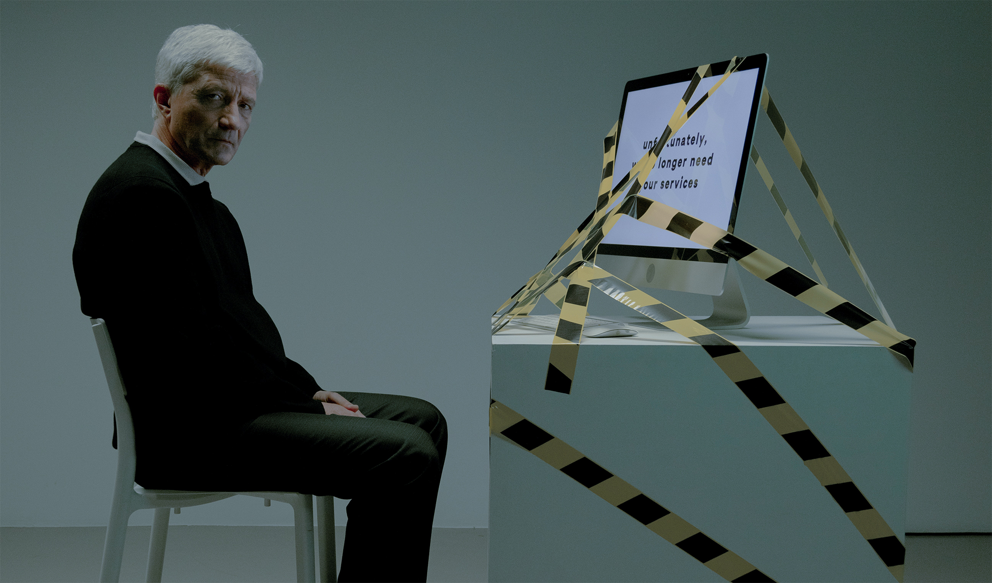
This blog post was inspired by Jacob Nielsens’ top 10 web-design mistakes in the 2021 keynote speech.