Usability of banking sites in Estonia: business customers user test
We created a set of user tests to learn about the usability of banking sites in Estonia. Here’s what we found out.
Banks are constantly competing for new business customers. Different banks have various products, services and contract terms for clients to choose from. Comparing and contrasting all the info from all their homepages might become tedious, so it’s best to create friendly homepages to navigate in.
Banks’ business product portfolios, finances and numbers sound dull and not that exciting. Good user experience might make it more enjoyable. On the other hand, bad user experience can scare away potential customers. Reacquiring the user might become costly, especially when they need to fix user experience flaws surface.
McKinsey’s 2018 report viewed this topic from a monetary standpoint and concluded that businesses lost over 300 million dollars due to bad user experience.
The biggest use of funds was on fixing bad decisions after the launch. Fixing these bad decisions during the development phase could make them 100 times cheaper to mend, as opposed to doing it after real-world customers have started using the product. (The value of UX design)
Investing in user experience could shorten development cycles by 33-50%. American Airlines saved 60-90% of the costs related to bad UX, by pre-emptively dealing with it before launch.
We also covered this topic in a previous blog post, where we took a look on how even software developers can u
Good and bad UX can create different emotions. But does this emotion matter when choosing a suitable banking service for business endeavours?
Sharewell inspected the user experience of four major banks here in Estonia: SEB, Swedbank, LHV, Luminor.
Test users were asked to evaluate the websites of these banks. The main focus was to understand, how easy it was for a new user to find suitable information, if and which problems arise during navigation and how does the overall experience feel for them.
Customers have different needs and tastes. Therefore, they search for specific terms and product packages on these sites. A clear goal was given to testers: use the bank’s search engine to find the page containing the information about a service most suitable for them.
As well as finding that webpage,
they were also asked to evaluate how easily they could find the information and
if there was enough of it. The time it took for testers to navigate and arrive
at the end goal was also recorded.
At the end of these test sessions, users were asked to bring out 3 positive and negative details or factors about their experience.
The participants of this test were all entrepreneurs. Thanks to Sharewell’s precise targeting and the large pool of testers, we could find suitable testers quickly. We also excluded testers from evaluating their current bank of choice. This also eliminated the bias that they would have when using an already familiar service provider or site.
All four tests included five testers each. Let’s take a look at the results one-by-one:
#1 SEB user test and results
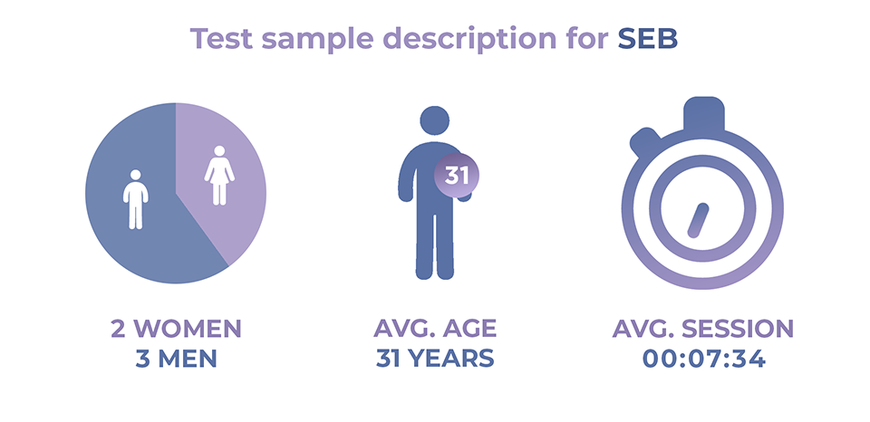
From the five users that participated, three were men and two women, with an average of 31 years of age. All of them had higher education.
Even though SEB has clearly described their product packages on their website, users still had problems finding respective information about these offers. This in return influenced the time it took for them to complete the navigation process, which averaged out at 7 minutes and 34 seconds.
Participants pointed out that SEB has a broad selection of products and services. Also, the vast possibilities for international business operations is a bonus.
But the broadness also came across negative as there are too many options to choose from. Some testers pointed out that when businesses start to grow, business owners have to start reevaluating these options and adjust their banking services accordingly.
Also, asterisked benefits were unclear and users had to search to learn more about them by finding fitting information themselves. An easy link to explain these benefits could have been very helpful.
#2 Swedbank user test and results
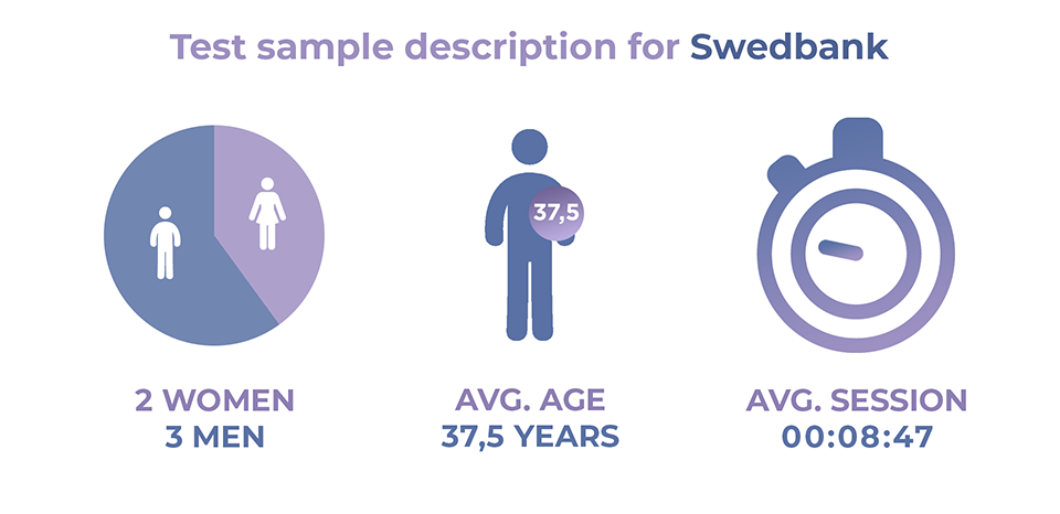
Swedbank’s test sample consisted of three men and two women, with an average of 37,5 years of age. Two of the participants had secondary and the other three higher education.
Out of all the tests we conducted, Swedbank got the most negative feedback. The constant reminder to log in became the biggest flaw for test users. On top of that, the superabundance of information became dull to read through.
The navigation menu was also confusing. Users were hoping to find essential information on different dedicated subpages, on which they found nothing relevant to their search for answers. Potential clients have to navigate and find the right pages by trial and error.
But Swedbank also had some positive feedback. Users pointed out that even though there is a lot of information to digest, simple advantages they hadn’t thought of before have been described clearly. For example, this was the case with information about the number of ATMs Swedbank has.
Because of participants having problems finding necessary information on products and services, Swedbank’s average test session duration was 8 minutes and 47 seconds.
#3 LHV user test and results
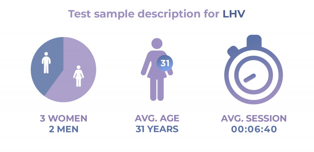
The sample for this test included two men and three women, with an average age of 31 years. Out of the five participants, one had secondary and four higher education.
LHV’s test had the shortest average duration, 6 minutes and 40 seconds.
The overall feedback was positive. Users liked the comparison table with other banks, allowing clients to see what the options on the market are. Easy access to essential information and simple charging terms were also commended. Necessary details were found quickly.
There was no negative feedback from the users who took part in this test.
#4 Luminor user test and results
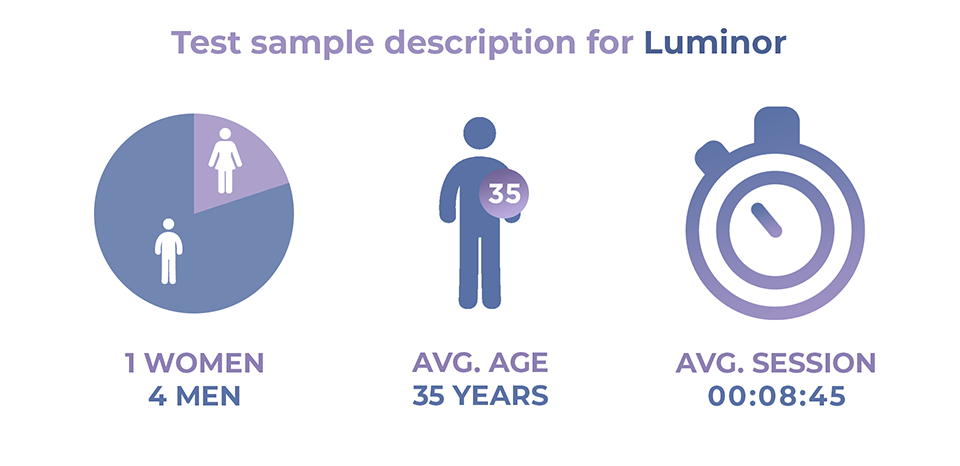
Four men and one woman participated in this test. The average age of these five testers was 35 years. Two of the testers had secondary and three had higher education.
Sessions for Luminor averaged out at 8 minutes and 45 seconds, this being the second-longest test out of the four we conducted.
Users applauded Luminor’s modern design and the comparison table they have added to their product descriptions. The long scrollable menu received negative feedback as it was too complex and confusing for a new visitor to use. Also, navigating with the search engine proved to have a toll on the session duration. Users spent too much time adapting to it.
These were the four short tests our team created and executed. Out of the 20 users we tested, 12 had chosen LHV to be their choice of bank. If we look at the feedback we collected, LHV was also the bank that had the least amount of negative feedback, or none at all as we have already described here.
As stated before in the preface, we looked at how easy it is for the business customer to search suitable information with search engine tools provided by these four banks. We also recorded how testers reacted to both positive and negative revelations: were they frustrated or satisfied with their search?
In conclusion, we can say that emotions related to user experience do matter. Users who have bad user experience become frustrated and might give up. Complex menus and search engines make it harder for the client to arrive at conclusions. Nobody wants to learn how to use these tools in the first place.
Financial institutions are sophisticated to begin with. Dividing all the various details and terms into different subpages is necessary, but the flow between these pages must be clear as well.
We established that emotions do matter, but how much exactly. When does a new potential customer give up and decide to sign a contract with a competitor with better user experience? With
these short tests, we can’t say.
But we do know that even these simpler tests can yield great results for all businesses. As we saw, potential clients pointed out problems they encountered while browsing. These problems could also make or break whether this entrepreneur becomes a new customer or not.
All of these issues can be researched further and the gathered insight can be used to fix any errors, making the product or service you provide more user friendly.

