Achilles heel of usability testing.

With the development of similar products, competition for consumer attention has increased. So it is expected that researchers try to understand why some businesses are more successful and more widely used than others.
It turns out that it is not enough with a stunning product anymore. Sparkle is needed, and that spark is a “great user experience.” It is something so simple yet hard to achieve.
Usability testing is a user experience research method. It uncovers where people will fail when using your product. Seeing where people fail and understanding the nature of that failure can help you fix the user experience.
Usability testing to improve UX.
The user experience, or how the user feels when using the product, is an essential factor in which product the user will choose (if there is a choice). One way to understand how to build and improve a user experience is to run tests. The tests can be performed both remotely and on-site, where the researcher tries to understand whether the solution is usable in practice or not.
For example, in a hotel booking app, users can make a reservation and understand that it has been sent and confirmed. With this test, you can discover the issues with the product, and it is extremely useful to improve its functionalities. Usability testing evaluates the product or service, improves its functionality, and validates the solution against user expectations.
Usability testing traps:

Usability testing can do one thing and do it really good: uncover where people will fail when using your product. Seeing where people fail and understanding the nature of that failure can help you fix the user experience.
You have to be careful that you don’t fall into one or more of these usability testing traps.
1. Looking for suggestions.
When doing usability tests, you’ll frequently find testers who offer potential solutions to your product’s problems. Some will express their dissatisfaction with your site’s use of colors. Others may state that they need a popup to explain things. When it comes to comments like those, you have to be very careful.
You want to encourage the user to say whatever is on their mind. If you want to get the most out of your usability test, your users need to speak up. The usability test is about identifying the actual problems, and it’s up to you to figure out how to fix them.
Most test users are unlikely to have the design, analytics, or user experience backgrounds (if that’s not the target) required to develop practical solutions. You can’t expect test users to do your work for you.
Use their comments and visual cues to identify the major difficulties they face and learn more about them. Instead of relying on usability test comments on changes, you should be the one coming up with the best solutions to tackle issues.
2. Making usability tests complicated.

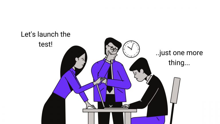
Usability testing is frequently neglected because it transforms into this big thing. It was supposed to be a once-a-month or twice-a-month project, but it’s turned into a multi-team, time-consuming, convoluted reporting line item.
It does not have to be this. All you have to do is treat it as a process and don’t overcomplicate things:
- Be practical about selecting test users.
Don’t get hung up on finding test users yourself. Instead, use platforms that already have a testers pool. You’ll save A LOT OF TIME.
- Don’t get too many users.
You need about five users for three rounds of tests. Any more will just add to your time and expenses and make testing more challenging.
- Don’t present it as something you’ll need statistical significance.
To be valid, quantitative research must have statistical significance. Usability testing don’t. They’re there to identify critical flaws swiftly; don’t oversell the science to your colleagues.
- Go for a simple usability test report.
Because some firms pay for usability studies through agencies, it can be tempting to desire and demand a rich report that takes just under a month to produce. You don’t require such a detailed report.
After observing the usability tests, you should be able to identify the top 5 or so essential issues that prevent people from performing what they need to do. You only need a few bullet points in an e-mail or word document. Creating a fancy report prevents you from addressing the issues sooner.
- Creating too many or the wrong tasks.
Getting to know users can be addictive. This means that you might want to include many tasks to gain more information from one user. While there is nothing wrong with that, you must remember that users are human. Therefore test participants might tire and lose focus if the test is longer than 40 minutes.
In fact, most adults can concentrate only about 4-5 hours a day. Don’t expect all that focus for your test.
3. Making biased conclusions.
We all are human and, therefore, can fall to biased conclusions. The good thing is that if you know these biases, it is easier to avoid them.
User research bias can be from the test participants’ side and/or from the researchers’ side. Cognitive bias can have a significant impact on the product design process. As a UX researcher, if you are unaware of them, you can fall into the trap of flawed conclusions. A systematic error in thinking caused by cognitive biases can affect your team members’ judgments and product design decisions.
How to improve user experience?
Create a more risk-taking culture in your organization that encourages your staff to explore and experiment.
To be successful, user experience (UX) cannot be an afterthought or an add-on; it must be at the forefront of your development strategy. It must be rooted in the company’s and development teams’ cultures.


